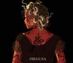
shading colour tips

brittajj26:

nocturnenebula:

bravestghost:

hey yall its me the Art Mom™ to help you shade pretty

rule 1: DO NOT SHADE WITH BLACK. EVER. IT NEVER LOOKS GOOD. 

  • red– shade with a slightly darker shade of purple
  • orange– slightly darker and more saturated shade of red
  • yellow– i think like..a peach could work but make it a really light peach
  • green– shade with darker and less saturated shade of blue or teal
  • blue– shade with purple
  • purple– a shade thats darker than the purple you’re using and maybe a little pink (MAYBE blue)
  • pink– darker shade of red
  • white– a really light lavender or blue..or i guess any really light colour??
  • black– okay listen dont use pure black to colour anything unless you want to leave it with flat colours because you cant really shade black lol
  • grey– a slightly darker shade of purple or blue (less saturated)
  • brown– slightly darker and less saturated shade of purple or red

aaaaand thats all i got lol. let me know if there is anything i should add to this list!!

If you’re a visual learner…

I made some Balls of Colour to go with Art Mom™’s post:

SO USEFUL!

startrekrenegades:

boxlunches:

trojanphoenix:

heatherbat:

aquaticallyinclined:

“When they were little girls, they decided that they would be best friends forever. A whale never forgets a promise.” -Anneliese Juergensen

i have now died. of joy.

I don’t think I’ve seen art of an old mermaid (mermatron? mergranny?) before.

I love it!

Oh look it’s the most amazing thing I’ve ever seen

This is really amazing but I have to say, I read “mermatron” not as “mer-matron,” but as “merma-tron“ and I was just like MERMATRON. AUTOWHALES. SWIM OUT. and I’m ruined my brain is ruined I’m so sorry